
State eCommerce
California eCommerce Web Design (CA)
A design concept for California
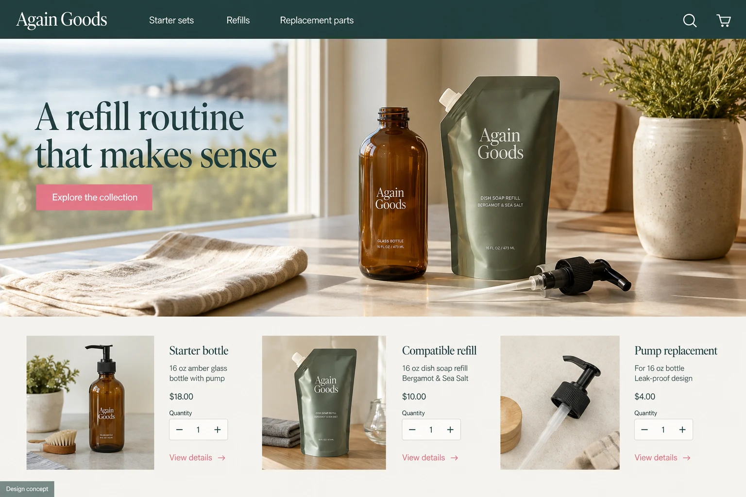
A refill shop needs to explain a system, not just sell a pouch. Consider a hypothetical California household retailer whose customers can buy a starter bottle, a refill, or a replacement pump. The website should make those choices easy to distinguish before checkout.
Show the relationship between products
Each refill page should name its compatible container and show the amount supplied. A diagram can explain how the merchant’s system works, supported by written instructions that remain readable without the illustration. Avoid broad environmental claims unless the business has evidence for the specific statement. The useful promise here is much simpler: customers can understand what they are buying and whether it works with what they own.
Make repeat shopping shorter
A returning buyer should be able to reach refills directly from the main navigation. Keep the starter collection visible for newcomers, but do not make existing customers browse through bottles every time. Product cards can display the product type, size, and scent or unscented option. Where packaging changes, preserve a clear explanation of compatibility rather than assuming a familiar label is enough.
Explain the first order completely
A starter page should show every component in the package. If a pump is separate, say so beside the purchase controls. Describe product use with the manufacturer’s approved instructions and include ingredient or care information where applicable. Lifestyle photography can help establish a clean visual identity, while close images of closures and labels answer questions a decorative countertop scene cannot.
- List container and refill quantities consistently.
- Identify all compatible product versions.
- Show what the starter package contains.
- Keep replacement parts easy to locate.
Measure the path from starter to refill
Review starter purchases and later refill orders as different stages. Watch for people adding an incompatible container and refill to the same basket, then improve the explanatory links. If the merchant has no reliable way to identify compatibility, avoid a confident automated recommendation. A website cannot establish product performance from appearance alone or verify a customer’s existing bottle remotely. For this California concept, helpful design means clear product relationships, honest instructions, and a repeat purchase path that respects the customer’s time.
This AI-generated website concept illustrates a fictional business. It is not a completed customer project. Features shown here need to be discussed and scoped for your business.